Boosting conversion rates of your School’s website boils down to two principles: igniting visitors’ motivation to take action and streamlining the process for them. Sounds simple, right? Here’s the catch, you need to really grasp your users’ needs, addressing their burning questions and showing the value that your School brings.
In this guide, we explore all the essential elements that make a compelling CTA to help you increase your School’s admissions.
What is a CTA?
A Call to Action (CTA) is a prompt or instruction designed to encourage an immediate response or specific action from your audience.
Provide value to increase school admissions and open day sign-ups
Your aim might be to increase open day sign-ups. Try answering this question first: is completing a form for attending my School’s open days a cumbersome process? Then possibly your prospective attendees will feel less inclined to complete this as the effort it requires won’t seem to outweigh the value and this can drop your conversion rates.
Let’s break down the psychology behind conversions. If coming to your open day feels like a valuable experience without being a hassle, more parents will likely join in. It’s about making the decision for them easy and exciting!
In short, provide value to help direct users to make the action you want them to take.
For instance, you can include a video next to the form followed by a CTA such as ‘Book your tickets’ or ‘Book your place’. Your video can also give information about the School and testimonials.
Different types of conversions and CTAs
Downloadable content
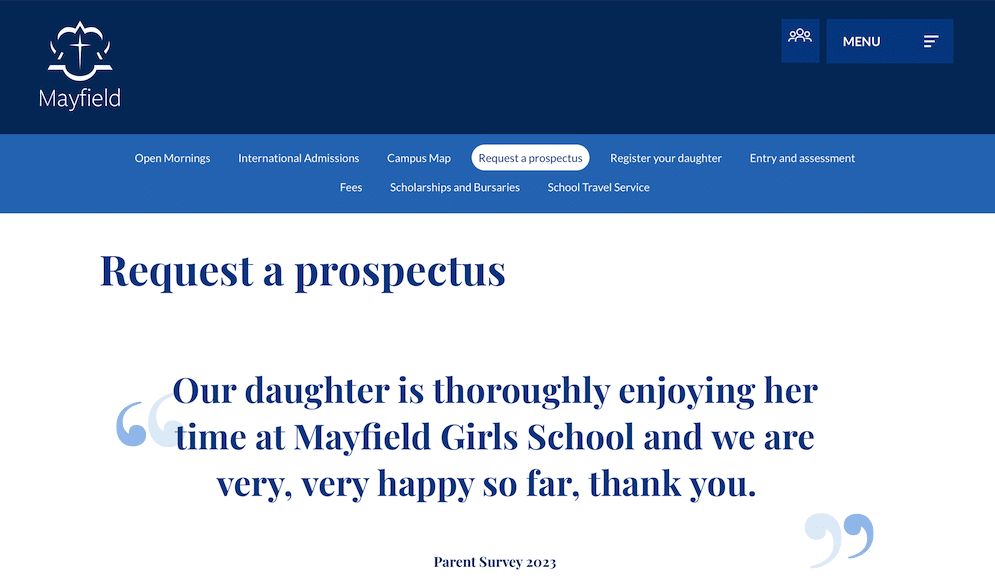
With this type of content you can help parents find more information about your School and this also allows you to gather contact details so that you can follow up with those leads.
Mayfield is ready to help prospective families to find out more about their School and familiarise them with its value proposition.

Inquiry
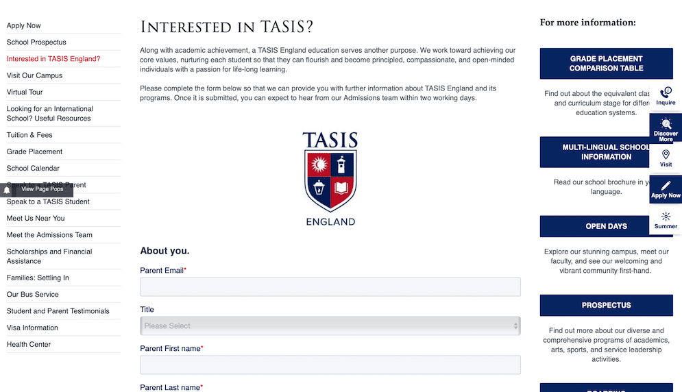
Having an inquiry page can help with your lead generation activities. You can come into contact with interested families that are considering their options and thinking that your School might be a good fit for their children’s needs.
TASIS provides lots of information next to this form for those families that are not ready yet to convert and looking for more information. Providing convincing information and backing this with evidence can direct your leads to click on the ‘Inquire Now’ button.

Social media CTAs
Social media platforms can help you increase the awareness and at a later stage build the engagement between your School and prospective families.
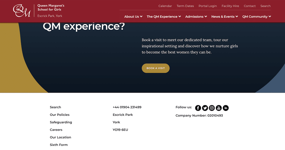
A simple CTA next to the social media icons can direct them from your website to your social media and prompt them to potentially keep an eye on your recent activity.
Queen Margaret’s School uses a ‘Follow us’ CTA at the bottom of their webpage inviting parents to have a look at their social media activity.

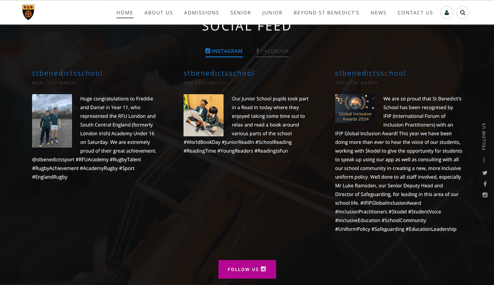
St. Benedict’s has a section on their website with key highlights of their Instagram account showing great imagery to compel prospective parents to follow them on Instagram.

Other CTAs could be:
- Connect with us for the latest updates and insights.
- Join our community for regular updates and insights.
- Stay connected! Follow us for exclusive updates and community highlights.
So what makes a compelling CTA?
A good CTA should have the following:
Be clear and not generic
Ensure that your CTAs are clear and help your visitors understand what will happen when they click – whether it’s scheduling a visit, applying for admission, or requesting information. For example, compelling CTAs could be “Apply now for admission” and “Book an open event”.
Include action words with urgency
Use action words to drive immediate action. This encourages your visitors to take the next step as you’re using compelling and dynamic language which is hard to resist. “Secure”, “Book”, “Discover”, “Join”, “Apply”, “Schedule” are a few verbs that promote actions.
Pay attention to the design of your CTAs
Make your CTAs stand out. Studies have shown that you can increase your click-through-rates by 42% by adding visually appealing CTAs. Choose contrasting colours to the background to draw the attention of your visitors. Also, give special attention to the buttons by creating a prominent, clickable button with rounded corners.
Complement your overall design with relevant images. You can then A/B test different variations of your CTAs to find out what works the best for you. Try to A/B test one element each time. This might be your button colour or the wording of your CTAs.
Support your CTAs with other elements
This will encourage more parents to click on the CTA button if you add elements that increase your trustworthiness next to it. These can be success stories of your recent graduates, testimonials, etc. Strategic placement of these elements can increase your conversions. Consider placing your CTA above the fold and ensuring the natural flow of the information presented on your page.
As your School navigates the digital realm of marketing, optimising your CTAs becomes a cornerstone of successful enrollment strategies, ensuring that every interaction is an opportunity to showcase the unique value and opportunities your School has to offer.
If you would like more professional tips on marketing your School do get in touch with the Digithrive For School’s team who are always happy to help. Contact us here.