From providing information at the click of a button to next-day delivery for your shopping, the internet has completely transformed society. For schools, while brochures, telephone calls and in-person Open Days used to reign supreme, the internet revolution has made online interaction with prospects more important than ever. Having a user-friendly and smart-looking website is essential for several reasons.
It makes a good first impression
A professional-looking website is a fantastic first impression for prospective parents and students. The internet is the very first thing most people turn to when researching anything, including schools. If your website is slow or unattractive, this will put people off progressing with an enquiry or application. According to research by WPengine, a one-second delay in page load speed can lead to 11% fewer page views, 16% decrease in customer satisfaction, and 7% loss in conversions. Check your page load speed and make the necessary adjustments for it to be as speedy as possible.
The application process is smoother
Likewise, your school website needs to be user-friendly in order to make it as simple as possible for prospective parents to find what they need. This could be an email address to get in touch with the school, a form to fill in to book an Open Day slot, or simply somewhere to find out basic details about the school. Your website needs to be easy to navigate, and you should hire a professional web developer to help with this.
It acts as an online portfolio
Think of a visit to your school website as a preliminary open day. It is a place to not only provide information but give insight into your school’s ethos and highlight the best things about your school. One way to do this is with a blog or news section where you post about students’ achievements, important events, and letters from the Head. Lots of nice images and even videos will help communicate what your school is all about before parents and students attend a physical or virtual Open Day.
From easy navigation to excellent aesthetics, take inspiration from these three schools with good websites.
Eltham College

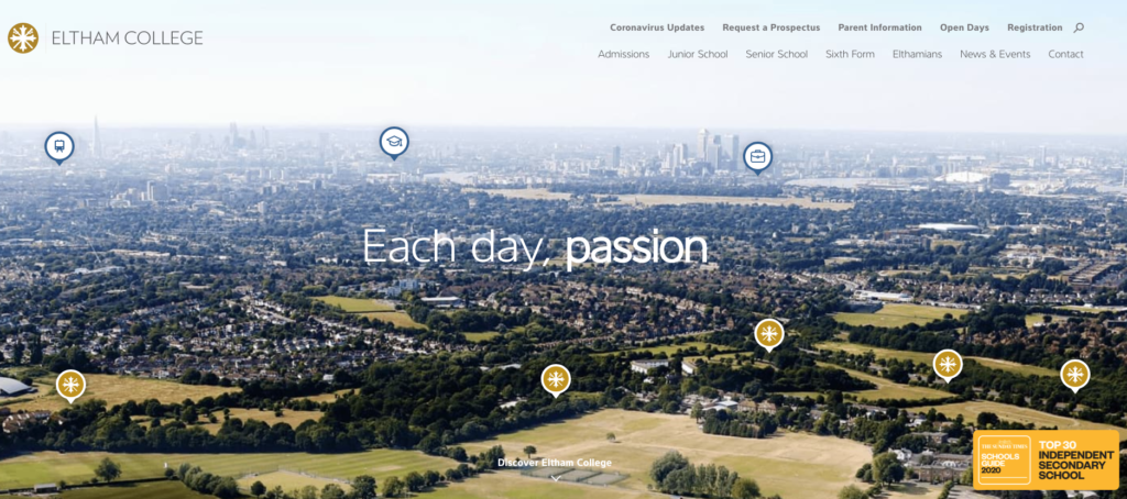
Eltham College’s website is immediately visually appealing, with a large image showcasing the school’s impressive grounds. If you hover over each icon, it shows a fact about the school such as “Over 80% of students gain a place at Oxford, Cambridge or other Russell Group universities”, a fantastic selling point. There is also a navigation bar at the top of the website with tabs for every category a parent or student could need, from Coronavirus Updates to Registration.
Scroll down and the school has a virtual tour available to watch online. This allows prospective parents to immediately take a look around the school itself — clearly, the school knows its facilities are a big draw and have highlighted this on their homepage.
Gordon’s School

Gordon School’s News section provides easy access to the school’s virtual tour as well as the latest school news. From sporting successes to charity ventures, this is a fantastic way to gain insight into some of the school’s goings-on and adds a personal, friendly touch to the very professional-looking website. The News section is right next to a link to the school’s Twitter feed, a great way to get more followers who are interested in keeping up to date with the school.
A strong colour scheme, easy navigation, and quick page load speed together with a school calendar and information on each aspect of the school makes this an exemplary website.
St Dunstan’s College

St Dunstan’s College has found a creative way to direct prospective parents and students straight to their ‘Discover’ page. As soon as you enter the website, a pop-up tab provides the option of visiting the Junior or Senior school page, which has a welcome from the Head, details about the school, a button to register and more.

This is a great way to lead prospects to the exact location that you want them to go, rather than have them browsing the main school website which houses lots of information for different purposes. People who aren’t interested in this can simply click ‘X’ and proceed to the normal school website. What’s more is that they have made this pop-up box suitable for mobile users, which according to WARC accounts for 51% of global internet users.
If you would like more professional tips on marketing your schools do get in touch with the Digithrive For School’s team who are always happy to help. contact us here